gold 2024
gold 2024
BEYOND
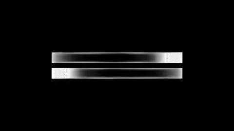
For the Interactive Media Design Day event of the Design School St. Gallen (GBS), I developed the identity under the motto «Beyond». At this annual event, internationally renowned personalities from the design industry are invited to give lectures and lead workshops. When designing the branding, my main focus was on maximizing the reduction of design elements. I kept asking myself how far I could push the concept so that the core idea would stand out clearly. The resulting branding is just a simple, linear black and white gradient within a square, giving the impression of a space that extends into infinity... and maybe even beyond.
https://www.imdsg.ch


Bewertungen der Jury

9/10
A minimalist idea, consistently implemented. The interaction creates a surprise effect that only comes at a late stage. But then you stay with it all the longer and keep playing.
8/10
The «Beyond» project impresses with its highly reduced design, which creates a unique atmosphere of minimalism and simplicity.
The interactive design element on the website is visually captivating and attracts the visitor's attention as soon as they enter, making the atmosphere of the «Interactive Media Design Days» immediately tangible.
The outstanding feature of the website is its minimalist simplicity. The typography appears modern and harmonious, supporting the content architecture. The design impresses with its clear focus on communicating the content. The well-executed transitions add an extra dimension to the user experience without being distracting, creating an intuitive user experience. «Beyond» fuses aesthetics and usability, resulting in a successful synthesis of clarity and functionality.
8/10
The "Beyond" project has been a success, both in terms of its design and user experience. The website's minimalist and contemporary approach manages to perfectly capture the essence of what is expected for a design school event.
The most striking feature of the website is its elegant simplicity. Each element has been carefully aligned, creating a clean aesthetic. The typography also deserves special mention, as it adds a touch of modernity while ensuring optimal legibility.
The website's interaction is fluid and intuitive, offering a pleasant browsing experience to users. Transitions have been executed well, without being too distracting, and they add an extra dimension to the user experience. Every visual element seems to be perfectly in tune with the conference's subject matter, helping to create an immersive atmosphere for site visitors.
In short, this conference website is a convincing example of successful web design. While its minimalist and contemporary design is remarkable, what sets it apart is its ability to effectively convey the essence of the event it represents.
Total Ø
8.3/10


